Company
Hijra
Date
January 12, 2024
Type
Mobile App
Role
Product Designer
Designing a Seamless Fast Transfer Experience
Improving the way users send money—quickly, intuitively, and securely.
Problem
In today’s banking and fintech world, speed and convenience are no longer luxuries—they're expectations. Yet, many banking and fintech apps still burden users with friction when performing something as routine as sending money.
We were seeing drop-offs at the transfer confirmation stage and repeated user complaints about the process being too “clunky” or “not instant enough.” It was clear: users wanted to transfer funds faster, with fewer steps and less cognitive load.
The goal was straightforward:
Design a “Fast Transfer” feature that allows users to send money to their recipients.
Role
As the Product Designer, I led the end-to-end design process, from ideation to prototyping and handoff. I collaborated closely with the product manager, ux researcher, engineers, and compliance team to ensure the experience was both usable and compliant with security standards.
Design Process
1. Understanding User Behavior
I began by conducting user interviews and analyzing. The data revealed that:
70% of transfers were to the same 2–3 people.
Users felt the transfer flow had “too many taps.
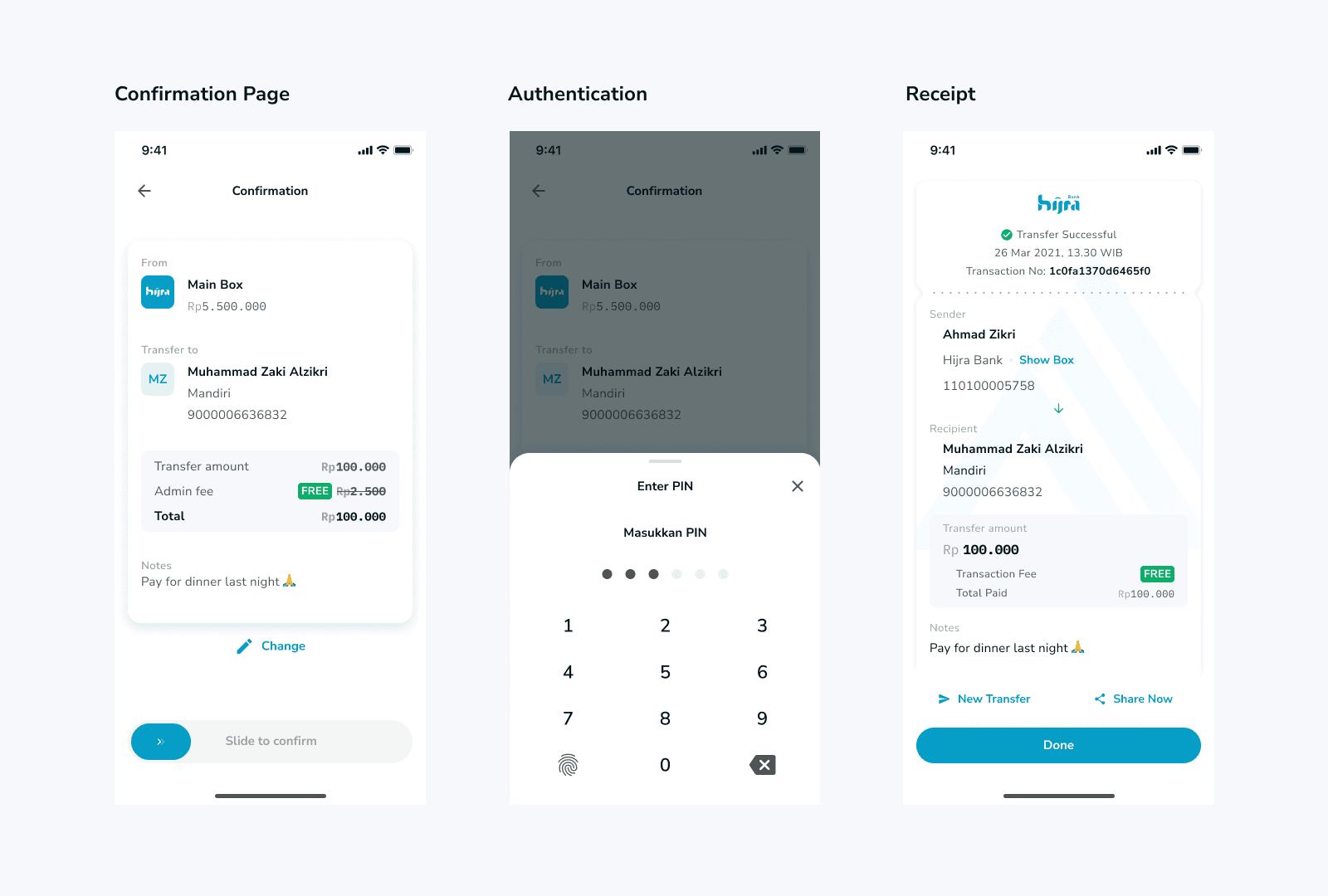
There was anxiety around sending money without reviewing details.
This insight helped frame our guiding principle:
“Fast, but never careless.”
2. Mapping Pain Points
Using journey mapping, I identified key friction areas:
Different landing page in several transfer entry point.
Extra layer in transfer destination.
Cognitive overload & visual clutter in transfer section page.
3. Ideation & Sketching
I explored ideas such as:
One landing page for all transfer entry point
Grouped component to give simple process transaction
Quick access for several feature on transfer
4. Wireframing & Prototyping
I built low-to-high fidelity prototypes to test :
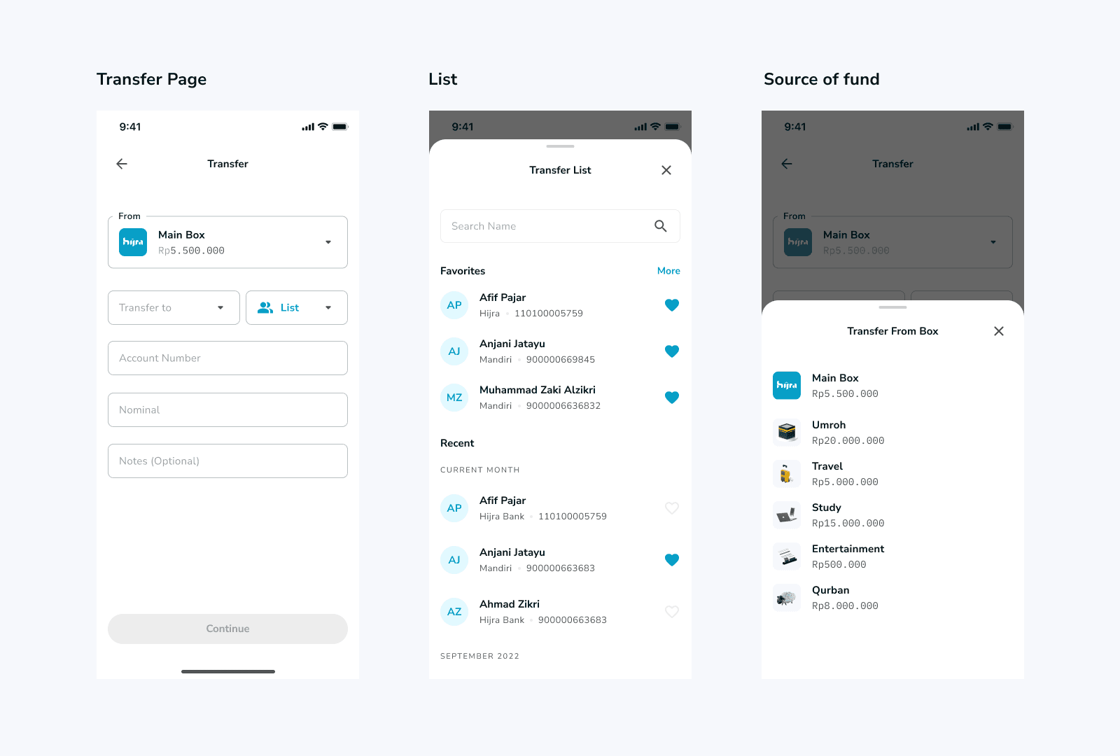
One landing page for all transfer recipient entry point : Hijra, new recipient, or Hijra box
“Bank or Box” now grouped to give simple process transaction
Quick access for List of Transfer Recipient by tapping on “List”
Quick access for recent transfer, favorite and all recipient
5. User Testing
We ran usability tests with 10 participants:
90% completed the flow in under 8 seconds.
100% felt confident with the confirmation step.
Minor tweaks were made to improve visibility of the “undo” option.
Framework
RESHOT: Refine the Challenge, Remove, Shrink, Hide, Organize, and Time.
Challenges & Solutions
Challenge 1: Different landing page in several transfer entry point.
Users wanted speed, but not at the expense of control.
✅ Solution: I designed a one landing page for all transfer recipient entry point : between Hijra, new recipient, or Hijra box, reducing taps while maintaining trust.
Challenge 2: Extra layer in transfer destination.
The faster the flow, the higher the risk of errors.
✅ Solution: Introduced quick access for List of Transfer Recipient by tapping on “List” and quick access for recent transfer, favorite and all recipient.
Challenge 3: Cognitive Overload & Visual Clutter in transfer section page.
Users felt overwhelmed by too much information presented at once, making it hard to focus on what really matters
✅ Solution: Introduced “Bank or Box” now grouped to give simple process transaction.
The redesigned Fast Transfer feature was rolled out in phases. Post-launch metrics showed:
⏱️ Transfer time reduced by XX%
📉 Drop-offs decreased by XX%
👍 User satisfaction (CSAT) improved by XX%
It became one of the most-used features in the app within a month.
Key Takeaways
Speed must be earned by trust: Designing for speed isn’t about removing steps blindly—it’s about knowing what users are willing to skip because they feel confident.
Design is never “just UI”: Collaboration with engineers and compliance helped me navigate limitations and still deliver delight.