Company
tiket.com
Date
January 1, 2021
Type
Mobile App
Role
Product Designer
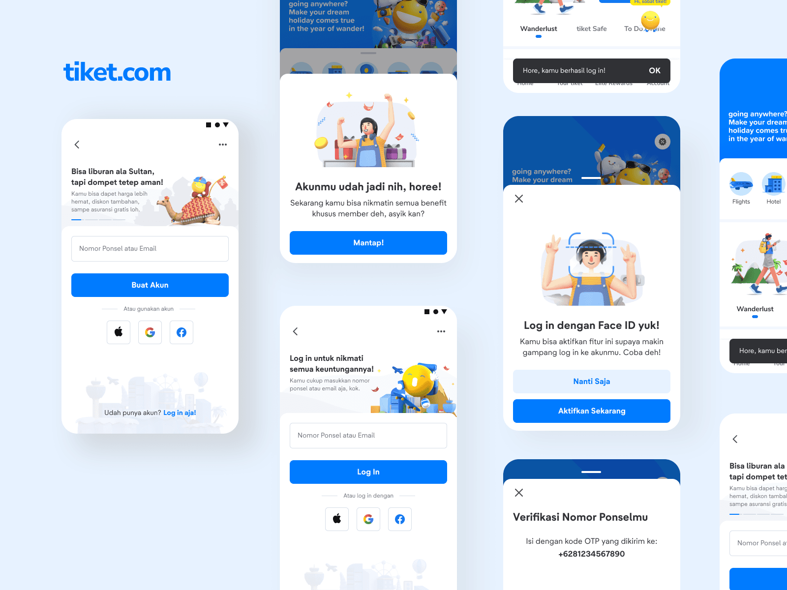
Reimagining the Log In/Register Experience
The Problem We Faced
At tiket.com, a leading online travel platform in Indonesia, we observed a persistent friction point in our user journey: the Log In and Register experience. Data showed high drop-off rates during authentication, particularly among new users. User feedback and analytics revealed a recurring pattern of confusion—was this a Log In form? A Register form? Why were they being asked for the same information twice?
Our hypothesis was simple: the conventional split between Log In and Register was no longer serving our users. In a world of mobile-first interactions and fast-paced travel decisions, we needed an authentication experience that felt intuitive, quick, and seamless.
My Role
As the product designer on this initiative, I took ownership of the end-to-end redesign of the authentication flow. I worked cross-functionally with product managers, engineers, and ux researchers to understand user pain points, ideate solutions, and deliver a production-ready experience that reduced friction and boosted engagement.
Design Process: From Challenge to Solution
Understanding the Users
I began with a thorough audit of our current Log In and Register flows, followed by competitive benchmarking and usability testing. Three key insights emerged:
Cognitive Load – Users struggled to identify whether they should log in or register, especially when returning with a different device.
Redundant Inputs – The same fields (like phone number or email) were being entered multiple times across different flows.
Device Behavior – A majority of users accessed tiket.com on mobile, where every second counts.
These findings shaped our goal: to create a Onefield Experience, where users could enter just one piece of information (phone number or email) and be guided intelligently based on their status—new or existing.
Designing the Onefield Experience
The central challenge was to merge two distinct flows (Log In and Register) into a single, adaptive one without compromising clarity or control. Here's how I approached it:
Smart Detection Logic
I collaborated with engineers to implement real-time backend checks. When a user entered their email or phone, the system would detect if the input was already associated with an account.Progressive Disclosure
I introduced progressive screens that only revealed relevant fields based on the detection logic—ensuring minimal cognitive load and a cleaner UI.Unified Language and Microcopy
I rewrote the interface copy to eliminate ambiguity. Instead of "Log In" or "Sign Up," we used clear, action-oriented language like "Continue with Email" or "Enter your phone number."Error Handling & Edge Cases
I paid special attention to failure states: wrong input formats, expired OTPs, or already registered accounts. Each case was handled with specific messaging to keep users informed and in control.
Reflections & Learnings
This project reinforced my belief in designing for clarity over complexity. Sometimes, the best experience is the one that feels invisible. By letting the system do the heavy lifting, we empowered users to glide through what used to be a frustrating gate.
It also deepened my collaboration skills—balancing feasibility with ambition, aligning stakeholders, and advocating for the user experience through every sprint.
Next Steps
We’ve since started exploring passwordless authentication and biometric logins as the next evolution of this flow. The Onefield foundation has given us the flexibility to build upon a strong, user-centric authentication model.